Commercial
Anime GI Lighting Comparison
Likes
2
Views
88
 Orelon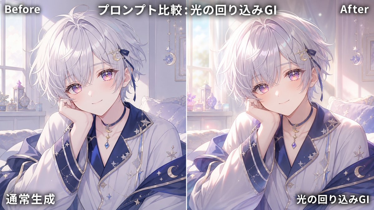
Commercial
Goal: Create a side-by-side comparison graphic demonstrating global illumination / indirect bounce lighting improvement on the same anime illustration. Canvas: Wide 16:9 horizontal image, split exactly into two equal vertical panels with a thin white divider line down the center. Use a soft pastel anime illustration style with dreamy morning light. Layout: The left panel is labeled “Before” at the top-left and shows the normal version; the right panel is labeled “After” at the top-right and shows the enhanced version with warmer indirect light, natural contact shadows, and soft glow wrapping around the subject. Add a large centered headline across the top reading {argument name="headline text" default="プロンプト比較:光の回り込みGI"}. Add bottom-left Japanese label {argument name="left bottom label" default="通常生成"} on the left panel and bottom-right Japanese label {argument name="right bottom label" default="光の回り込みGI"} on the right panel. All overlay text is bold white with a dark drop shadow for readability. Subject details: Show the same androgynous anime boy in both panels, seated indoors in a cozy bedroom by a bright window. He has fluffy layered {argument name="hair color" default="white-silver"} hair with lavender shadows, pale skin, and a slim elegant build. His face is intentionally covered by one large opaque pale mauve square censor block centered over the face in each panel; use exactly 2 censor blocks total, one per panel. His right hand rests near his cheek, partially visible beside the censor block. He wears a luxurious white robe or kimono-like top with navy-blue inner layers and wide sleeves, trimmed with metallic silver edges, decorated with star and crescent moon motifs. Include a crescent moon pendant necklace with a dangling blue gemstone. Background details: The room contains exactly 1 large window visible behind the subject, soft curtains, a bed or cushioned seat, a small shelf or windowsill with perfume bottles and ornaments, and exactly 1 hanging crescent-moon decoration on each panel. The palette is lavender, white, pale blue, and warm sunlight. Lighting comparison: Left “Before” panel should look flatter and cooler, with less bounce light and weaker shadows. Right “After” panel should visibly improve depth: add soft global illumination, warm sunlight wrapping around hair, face area, hands, robe folds, and shoulders; add subtle contact shadows where the hand touches the face area and where sleeves overlap; add bloom near the window and brighter rim light on the hair. Keep the character pose and composition identical between panels. Constraints: Countable elements must remain exact: 2 comparison panels, 1 vertical divider, 4 text labels total, 2 face censor blocks, and 2 hanging crescent decorations. No watermark, no extra logos, no additional panels.
This is a free AI prompt from the Orelon library. Thousands more image prompts here are free to copy and adapt.
Explore more image prompts

Ready to create
Start with this curated direction in Orelon, then shape it into your next visual.