
Foldable Recipe App Mockup
Transforms an open blank foldable device reference into a realistic dual-screen recipe app interface on the same tabletop scene.
게시일2026. 9. 10.
원문 언어EN
카테고리
좋아요
0
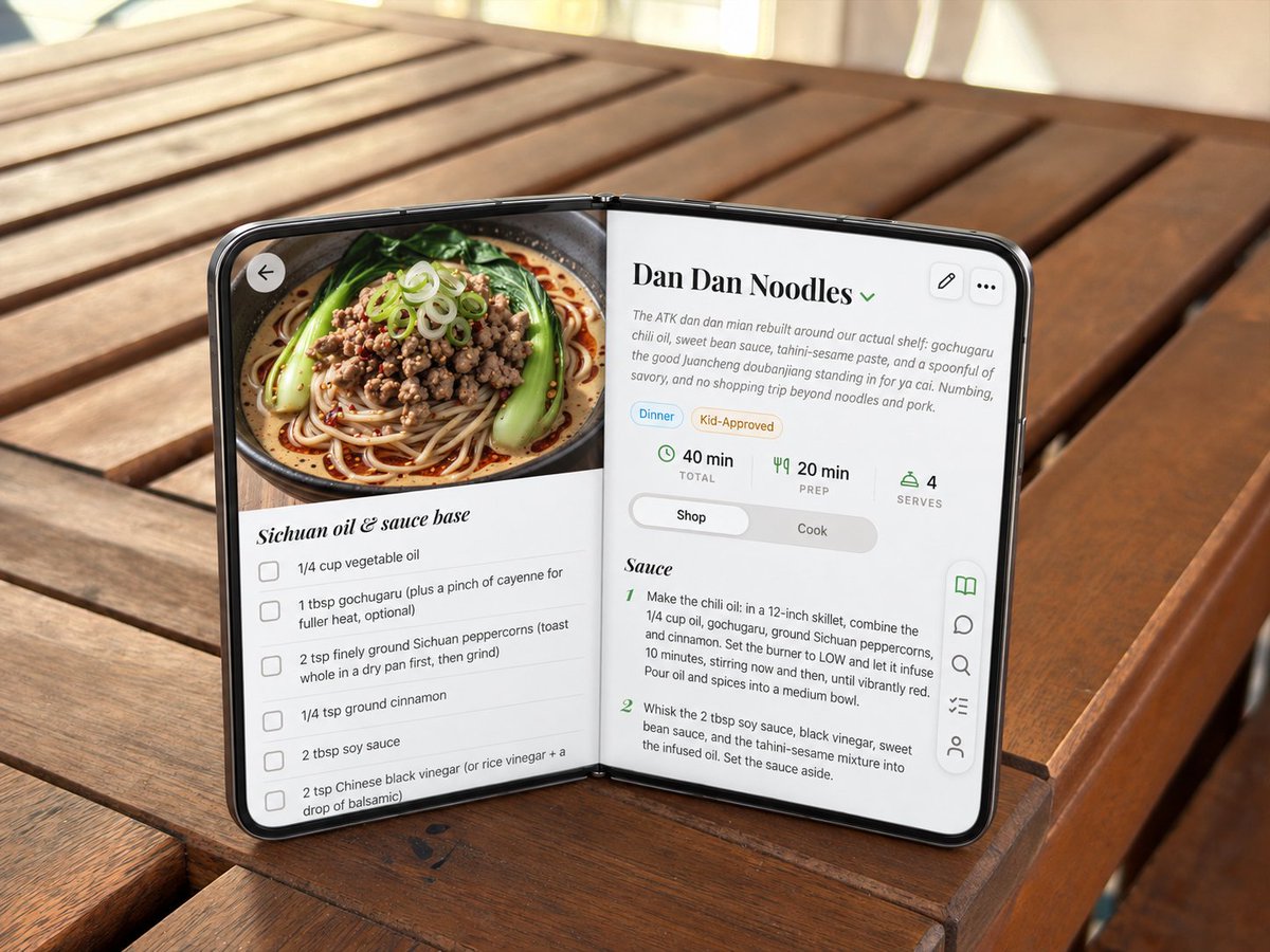
Transforms an open blank foldable device reference into a realistic dual-screen recipe app interface on the same tabletop scene.
Using the provided reference image, transform the blank open foldable mock device into a realistic open-screen smartphone/tablet running a polished recipe app UI, while preserving the exact tabletop setting, camera angle, lighting, hinge pose, and overall open-book orientation. Goal: Replace the gray blank panels with edge-to-edge glossy screens and a thin black phone bezel, making the device look like a premium dual-screen foldable phone in an open-book pose. Screen content: Show a cooking app recipe page for {argument name="recipe title" default="Dan Dan Noodles"}. The layout should span both halves naturally across the hinge. Left screen: Add a large appetizing food photo at the top showing a bowl of noodles with greens, minced topping, scallions, and chili oil. Under it, create an ingredient checklist section titled {argument name="ingredient section title" default="Sichuan oil & sauce base"} with exactly 5 visible checkbox rows: vegetable oil, gochugaru with optional cayenne, ground Sichuan peppercorns, ground cinnamon, and soy sauce / Chinese black vinegar text partially continuing near the bottom. Add a circular back arrow button over the upper-left of the food image. Right screen: Create the recipe detail and instructions panel. Include the title, a small green dropdown chevron, a short descriptive paragraph, two pill tags labeled "Dinner" and "Kid-Approved," and exactly 3 stat blocks: "40 min TOTAL," "20 min PREP," and "4 SERVES." Add a segmented control with "Shop" selected and "Cook" unselected. Below, show a section titled "Sauce" with exactly 2 numbered instruction steps visible. Controls: Add exactly 2 small rounded-square action buttons at the upper-right of the right screen: edit pencil and three-dot menu. Add a floating vertical toolbar on the lower-right edge with exactly 5 icons: open book highlighted in green, chat bubble, search, checklist, and user/profile. Style constraints: Keep the generated UI crisp, realistic, and slightly perspective-warped to match the device angle. Stretch the app to the screen edges, make the black rim and hinge believable, preserve the original warm outdoor wooden table background, and avoid changing the physical placement of the foldable device.
이건 Orelon 라이브러리의 무료 AI 프롬프트예요. 여기에는 자유롭게 복사하고 응용할 수 있는 이미지 프롬프트가 수천 개 더 있어요.
이미지 프롬프트 더 둘러보기



만들 준비됐나요
Orelon에서 이 큐레이션된 방향으로 시작한 다음, 다음 비주얼로 다듬어 가세요.