
Commercial
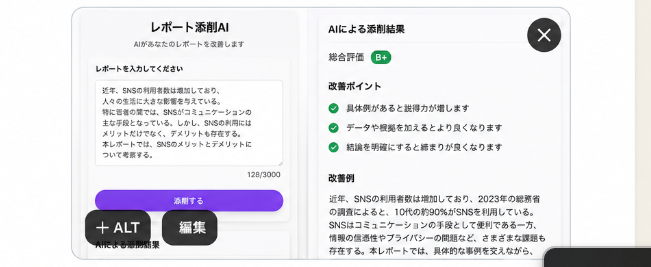
Japanese AI Report Correction App Mockup
浏览
27
Commercial
Goal: Create a clean, realistic mobile app mockup for a Japanese AI report-checking app, shown as a rounded white modal card on a light gray background, suitable for testing demand on social media. The app name should be {argument name="app title" default="レポート添削AI"} and the screen should look like a finished product UI. Canvas: Wide horizontal image, approximately 16:7 aspect ratio. Center a large rounded rectangle app window with a soft shadow, thin light-gray border, and bright white background. Add subtle vertical divider lines and very light gradients to make it feel like a polished SaaS/mobile web interface. Layout: Use exactly 2 main content panels inside the app window. Left panel is the report input area. Right panel is the AI correction results area. Place a dark circular close button with a white “×” in the top-right corner of the modal. Add two floating dark pill buttons near the bottom-left overlapping the modal: one labeled “+ ALT” and one labeled “編集”. A partial dark rounded bar is barely visible at the bottom-right edge, cropped by the image frame. Left panel details: At the top center, show the heading “レポート添削AI” and a smaller subtitle “AIがあなたのレポートを改善します”. Below, add the section label “レポートを入力してください”. Show a large textarea card with a sample Japanese report paragraph about SNS usage among young people; include a small character counter “128/3000” at the lower right of the textarea. Under the textarea, place one prominent purple rounded button labeled “添削する”. Beneath the button, add a tiny caption “AIによる添削開始”. Right panel details: Add the title “AIによる添削結果”. Show a rating row with label “総合評価” and a small green rounded badge labeled “B+”. Then create an “改善ポイント” section containing exactly 3 checklist items, each preceded by a green circular check icon: 1) “具体例があると説得力が増します”, 2) “データや根拠を加えるとより良くなります”, 3) “結論を明確にすると締まりが良くなります”. Below that, add an “改善例” section with a paragraph of Japanese corrected text beginning with “近年、SNSの利用者数は増加しており、2023年の総務省の調査によると、10代の約90%がSNSを利用している。” and continuing in small readable Japanese body text. Visual style: Minimal Japanese product UI, Apple-like rounded corners, crisp sans-serif Japanese typography, black and dark-gray text, green success accents, purple primary CTA button with slight gradient, generous whitespace, realistic soft shadows, high-resolution screenshot aesthetic. Constraints: Keep the UI text in Japanese exactly where specified, use no extra panels beyond the 2 main panels, include exactly 3 checklist improvement items, no people, no illustrations, no watermark, no browser chrome, no phone frame.
这是 Orelon 提示词库里的一条免费 AI 提示词。这里还有成千上万条图像提示词,都能免费复制和改用。
探索更多图像提示词




准备好就开始
从这条精选创作方向开始,在 Orelon 中塑造你的下一张视觉作品。