
Commercial
Chrome Driftique Typography Poster
浏览
25
Commercial
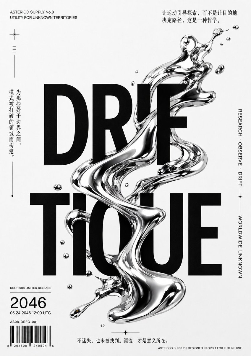
Goal: Create a minimalist monochrome futuristic editorial poster for {argument name="poster title" default="DRIFTIQUE"}, combining brutalist typography with a glossy liquid-chrome abstract sculpture. Canvas: Portrait poster, 3:4 aspect ratio, off-white paper background with subtle grain and slight mottled print texture. High-contrast black, white, and mirror-silver only, with a clean Swiss/experimental design feeling. Main layout: Place the title as two huge stacked words in ultra-bold black condensed sans-serif capitals, centered and dominating the page: top line reads “DRIF”, bottom line reads “TIQUE”. Let the black type be partially interrupted and overlaid by the chrome form. Create one continuous twisting liquid-metal ribbon running vertically through the center, starting near the upper right of the title, snaking diagonally across the letters, looping through the middle, and ending as a bulbous splash near the lower center. The chrome should look like reflective mercury or polished fluid glass, with sharp highlights, black reflections, transparent edges, and warped reflections. Counted decorative elements: Include exactly 14 separate floating chrome droplets around the main ribbon: 3 small droplets near the upper right, 2 tiny droplets above the central title, 1 small oval droplet at left of the lower title, 2 small round droplets along the left side of the lower title, 3 droplets near the lower-left barcode area, 1 tiny ring droplet inside the center area, 1 teardrop droplet at the lower left end of the main splash, and 1 small droplet near the top of the liquid ribbon. Top-left text block: Small uppercase English text aligned left: “ASTERIOD SUPPLY No.8” on the first line and “UTILITY FOR UNKNOWN TERRITORIES” on the second line. Below it, add a tiny crosshair icon, then three short horizontal menu-like lines, then one thin vertical rule. Top-right quote: Add a compact Chinese quote in black serif-like type, aligned near the top right: {argument name="top quote" default="让运动引导探索,而不是让目的地\n决定路径,这是一种哲学。"} Left vertical text: Along the left side, set a vertical Chinese sentence with a thin vertical line and dot accents: {argument name="left vertical quote" default="为那些处于边界之间、\n模式被打破的领域而构建。"} Right vertical text: On the right edge, set vertical uppercase English microtype reading “RESEARCH · OBSERVE · DRIFT”, then a small star-like divider, then “WORLDWIDE UNKNOWN”, separated by thin vertical rules. Bottom-left data block: Add small text “DROP 008 LIMITED RELEASE”, then a large number {argument name="year" default="2046"}, then “05.24.2046 12:00 UTC”, then “AS08-DRFQ-001”, and a barcode with tiny digits beneath it. Bottom center and footer: At bottom center, include the Chinese line {argument name="bottom quote" default="不迷失,也未被找到。漂流,才是意义所在。"} Above the bottom edge. At the bottom-right edge, add tiny uppercase footer text: “ASTERIOD SUPPLY | DESIGNED IN ORBIT FOR FUTURE USE”. Visual style: Premium black-and-white poster design, experimental fashion-tech catalog aesthetic, crisp typography, abundant negative space, realistic reflective 3D chrome liquid, subtle paper grain, slight printed ink imperfections, high resolution. Avoid color except for extremely tiny warm reflection hints in the chrome, if needed. No extra logos, no people, no scenery.
这是 Orelon 提示词库里的一条免费 AI 提示词。这里还有成千上万条图像提示词,都能免费复制和改用。
探索更多图像提示词
准备好就开始
从这条精选创作方向开始,在 Orelon 中塑造你的下一张视觉作品。