
Effects by Tags
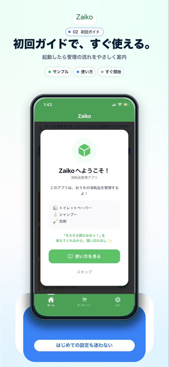
Japanese app onboarding promo mockup
点赞
2
浏览
59
Effects by Tags
A clean modern app-promo poster on a very pale mint-blue background, centered and vertically composed like a landing page screenshot for a Japanese inventory app. At the top, place a small rounded white pill logo with soft shadow reading {argument name="app name" default="Zaiko"} in green. Beneath it, add a smaller rounded outlined badge with a blue dot and the text "02 初回ガイド". Below that, set a large bold Japanese headline in dark navy: {argument name="headline text" default="初回ガイドで、すぐ使える。"}, followed by a smaller gray subtitle: "起動したら管理の流れをやさしく案内". Under the subtitle, show exactly 3 small rounded white category chips with soft shadows, evenly spaced: "サンプル" with a green dot, "使い方" with a blue dot, and "すぐ開始" with a dark dot. In the center, show a realistic modern smartphone mockup front view with a black bezel, slightly rounded corners, subtle reflections, and a dramatic soft blue glow under it. The phone screen displays the app UI with a green top bar and the title "Zaiko" in white, iPhone-style status icons at top, and a dimmed app interface behind a centered onboarding modal card. The white modal has rounded corners and a soft drop shadow, with a pale green circular icon area containing a green cube symbol at top. Then a bold welcome title in Japanese, "Zaikoへようこそ!", a smaller subtitle "消耗品管理アプリ", and body text "このアプリは、おうちの消耗品を管理するよ!". Add a light gray rounded list box containing exactly 3 sample inventory items on separate lines with tiny icons: "トイレットペーパー", "シャンプー", and "洗剤". Below that, add a small green-highlighted sentence: "『そろそろ買わなきゃ!』を教えてくれるから、買い忘れなし ✨". At the bottom of the modal, include a large rounded green primary button labeled {argument name="button text" default="使い方を見る"} with a small book icon, and below it a muted text link "スキップ". Behind the modal, the app UI should be visible but subdued: a green header, side category strips, and a bottom tab bar with exactly 3 tabs labeled "ホーム", "買い物リスト", and "設定", each with simple white icons. Beneath the phone, place a large rounded blue callout card with soft shadow and a centered white pill label reading {argument name="footer text" default="はじめての設定も迷わない"}. Use a polished Apple-style SaaS marketing aesthetic, soft gradients, subtle shadows, rounded UI elements, crisp typography, and a friendly trustworthy feel.
这是 Orelon 提示词库里的一条免费 AI 提示词。这里还有成千上万条图像提示词,都能免费复制和改用。
探索更多图像提示词




准备好就开始
从这条精选创作方向开始,在 Orelon 中塑造你的下一张视觉作品。